More on Raptor
Lately I have been researching a lot on usability and mostly the merits of Fitt's Law, the more I studied this law the more I believe that Raptor's approach to the issue is fundamentally correct.
Being a menu an appearing were ever a user might want to, one can not make usage of side infinite space, so what one might only use is the infinite space that is the space under were your mouse is.
The good thing about Raptor is that it can do that, put the thing you want to click right under your mouse,
Because 1 It knows were you mouse is, 2 it has a good idea on were you want to go.
But imagine it did not guessed entirely correctly, well it might be the second best answer or third, the ones that will be next to the mouse againg very good according to Fitt's Law.
Another good thing about Raptor is that its the next best thing after a pie chart in terms of clicking what you need, the number of pixel in a straight line are the ones that count, I believe that the fundamental difference in Raptor navigational system helps a lot giving a much bigger hit space that conventional menu systems.
screenies that exemplify.


I tried 2 common mouse movements in each solution (note that the span of the mouse movement in raptor should tend to be smaller cause of the placement of icons according to mouse zero point and usage database)
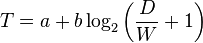
"T is the average time taken to complete the movement. (Traditionally, researchers have used the symbol MT for this, to mean movement time.)
a represents the start/stop time of the device and b stands for the inherent speed of the device. These constants can be determined experimentally by fitting a straight line to measured data.
D is the distance from the starting point to the center of the target. (Traditionally, researchers have used the symbol A for this, to mean the amplitude of the movement.)
W is the width of the target measured along the axis of motion. W can also be thought of as the allowed error tolerance in the final position, since the final point of the motion must fall within ± W/2 of the target's centre." (in wikipedia)
So the only 2 things we can play with is D/W ratio, since all other aspects do not depend on the actual positioning of the objects, and the smaller it is the better we are, so results: case 1 =3,44 case 2 (raptor) = 1,91. meaning Raptor clicking is almost 50% faster.
DIGG


Comments
(i) It appears that you are discarding the fact that the selection area (W) is _not_ in R^1, but R^2. If you haven't assumed this, then everything else you conclude is false. For example, it's pretty clear that the speed will vary wildly when moving my mouse _up_ from X to Y when nothing changes but Y's _width_ (not height). That is to say, moving up my cursor to a rectangle is quicker than moving up to the respective rectangle's square (as is the case here).
Actually, looking at the Wikipedia article it seems to mention this point as well. You would actually need to use Accot-Zhai's steering law.
With respect to that point, it would certainly favour Kickoff since it has a larger selection area (the white space on each item, which is still selectable).
(ii) I'm not sure if you're using figures from your image, but am I missing something, or are you clearly going over 1 more item in Kickoff than in Raptor?
Again, with regard to Fitts' law (even if it's misapplied here) this point also favours Kickoff.
(iii) And finally, you're presupposing that moving the mouse left-to-right is as-trained a movement as up-and-down, which is (at least to me) a little suspect, since webpages, file managers, and the majority of applications very rarely go from left-to-right, but rather -- up to down.
Especially for a left-to-right scrolling list, I think this will particularly not be as intuitive to the new user. Most people don't know that scrolling can be used in such cases (even if they frequently can), and this is pretty much an inevitability of Raptor's implementation, unless (1) you want the selection to automatically move depending on the mouse's position (confusing), or (2) want them to click on the 'left' and 'right' arrows (time intensive, so annoying).
Since Raptor is basically a dock, it will also be interesting to look into the weaknesses in terms of usability of docks.
W is the width of the target measured along the axis of motion
ence in kickoff case 34 ...
"it has a larger selection area"
not that much in the case of the big icons raptor ones are actuly biguer 34x200=6800 85X85=7225
nt to mention that if a given page as less than 5 enterues that space gets biguer as it used all available space.
ii) not that much I made anormal movement, you must agrea that normaly the space covered in kickoff is biguer couse there is no special sorting of the itens so its pure random, were in raptor the most click icons should apear right under your mouse.
Rpator is not a dock it was designed to work any were...
so all options will normaly be in the frist page if we had the fact that the user can define the hit ratio on frist page and the size of raptor I think that raptor is is far beter shape in that department than kickoff. That also cant display unlimited items, and that does not do any sort of ordering, has a "more" buton heven if there is more space available...
I haven't tried Raptor yet, but from what I can see in the screenshots, I have to say it looks really interesting.
I had a little presentation of KDE 4 yesterday at our local LUG, and showed Kickoff, Lancelot and Raptor.
Allmost everyone noted there first two as "too much windows menu like" - without me saying my opinion before (which actually is exactly the same).
But then came Raptor, and the "wow", "that looks great", "whe really need something like this for KDE 4", "finally something different from the windows-like menus we get nowadays", "I would love to try this and see how it handles".
The list could go on, there were a lot more of this comments. I too hope that KDE will choose Raptor instead of Kickoff/Lancelot/whatever-windows-like-menu. But that's - of course - my personal opinion.
Regards,
Ralf
> not that much in the case of the big icons raptor ones are actuly biguer 34x200=6800
A screenshot of mine shows it to be 38x389.
> nt to mention that if a given page as less than 5 enterues that space gets biguer as it used all available space.
If we really want to play this game of course we can just suggest Kickoff to use larger icons, if we're worried about it that much. Question is whether we have a reasonable balance, which is exactly what we seem to get. Huge shapes of circles and triangles will be even quicker in both launchers, but they're neither pretty nor practical.
> not that much I made anormal movement
Left-to-right is just _not_ as common as up-down, so you again can't use Fitts' law.
> there is no special sorting
If you read the usability studies you'll actually discover that this was actively researched, and then rejected. The fundamental reason being that (i) changing the order of things confuses users, (ii) there is a clear and direct difference between what apps a user launches most frequently and what they _think_ are their favourite apps.
> Rpator is not a dock it was designed to work any were...
I agree, but it operates very similarly to one. It also would emphatically _not_ make sense to have it anywhere but at the bottom (since it is, by its nature, a launcher).
> (raptor in defoult mode (can cope up to 10)
A bit of an artificial point since Kickoff's menu size is not exactly fixed. I think 7 is ideal, though; more is not necessarily better.
I think the idea of Raptor could be nice (pretty screenshots always are), but in terms of usability I've seen only disadvantages so far in comparison to Kickoff.
> W is the width of the target measured along the axis of motion
> ence in kickoff case 34 ...
Not sure where 100 comes from (it's not a multiple of 34, which is what each item is), but your Maths (even if it's also misapplied, from what I said before) is still erroneous since you're taking more Kickoff selections than Raptor ones.
I can acheive left-right with my wrist. If that's bad for carpel-tunnel then I can use my elbow or shoulder (rotation).
For up-down, I have to use my shoulder (forward-back). On a small scale, it's possible to use my fingers, but I notice fatigue quickly, and have to alter my grip.
My favourite feature for Raptor would be a global hot-key that makes the menu appear directly under the mouse. That way, I wouldn't have to change my focus to a different portion of the screen, or even move my mouse there.
apokryphos seems to be a little to stuck in convention. I suggest he stick to using Kickoff, and let those of us who want something different use raptor. Since when does a dock or launcher have to be at the bottom of a screen?
btw i ment D/W sorry misspled but looking at the numbers you should have seen it. right?
about the the items in betwin look closly they are actully the same 2 :) kontact and kooka in raptor
home and control center in kickoff
The position wont change all that it wil be based on the normal beaviur of the user, so the espected position for the icon he is searching for will be just under his mouse. and it will be all the time.
But like kickoff what we realy want to promote is the desktop app search and the database usage will make that alot more usefull.
you cant expect us to trust a value graete than 200 , im considrenig 200 and i think im being very generours on that normaly you would move a your mouse in a mostly rect pater from A to B saying that wyou will be offcourse 200 pixles in such a short travel is being very generous.
I think that you should apply the normal fitts law here I menn its all about a one dimension movement mostly , we are talking about list here so aplying the normal fits law is the best anser in my opinion, and Im prety sure you agrea 2.
"Left-to-right is just _not_ as common as up-down, so you again can't use Fitts' law."
you must be kiding right?
> For up-down, I have to use my shoulder (forward-back).
This is false. I can move my mouse from the top to the bottom of my screen while using solely my fingers/wrist and no shoulder.
> On a small scale, it's possible to use my fingers, but I notice fatigue quickly, and have to alter my grip.
This IS the small scale (we're not using the whole screen), and a launcher is just that -- a launcher for an application. You will not be using it repetitively for more than a few seconds, even if you are launching several applications.
That said, up-down is still the more clear mode of presentation for computers. Yes, let's just go against user's experience for something as minimal as a launcher -- how nice.
> apokryphos seems to be a little to stuck in convention. I suggest he stick to using Kickoff, and let those of us who want something different use raptor.
I'm stuck in convention because I maintain that using erroneous maths to reach a conclusion is not very productive? Come on.
> Since when does a dock or launcher have to be at the bottom of a screen?
You think there's a better place for the launcher to typically reside? You want it to appear wherever your mouse is -- great. You can already implement something similar to that with ANY of the menus, and secondly -- you cannot rely on this. Users simply won't do it all the time.
I'm really tired of people trying to think automatically that different = better. "Oh noes, the menu bears some resemblance to a Windows menu". Firstly, how unbelievably curious to make this connection (the old K-Menu was more similar). Secondly, "it reminds me of Windows" is not an argument. Rejecting something Windows did on the grounds of Windows having done it is pretty futile.
I have never said that the Raptor menu/launcher shouldn't be made or that anyone should not use it. By all means, create and use whatever you like -- that's what free software is all about. But you shouldn't expect people to accept unsubstantiated arguments on 'usability'.
sorry we canot pay alot off people to perform a uasbility study.
we will preform som usabity studies with the people willing to test the menu.
But you realy can refute fitt's law, I have benn told that so many times I actuly belive it now.
I see the 100, but 100 is not around the middle of any given entry. Perhaps you meant 102, which would be three items, but still...
> about the the items in betwin look closly they are actully the same 2 :) > kontact and kooka in raptor
> home and control center in kickoff
You can do that, but then your variables will be completely changing. Kolf and Kooka are evidently not 85x85.
> The position wont change all that it wil be based on the normal beaviur of the user, so the espected position for the icon he is searching for will be just under his mouse. and it will be all the time.
So you're talking about a search, here?
> you cant expect us to trust a value graete than 200 , im considrenig 200 and i think im being very generours on that normaly you would move a your mouse in a mostly rect pater from A to B saying that wyou will be offcourse 200 pixles in such a short travel is being very generous.
On the contrary, the distance is nearly twice that. It also ignores the way the menu is used. Almost _no-one_ stays within the first 200px of each item.
> I think that you should apply the normal fitts law here I menn its all about a one dimension movement mostly
In reality however no-one moves directly in a straight line, so you simply cannot use Fitts' law (you can use the steering law though). I can certainly see why you would want to simplify things and just use Fitts' law, but you would honestly be oversimplifying here. Typical mouse movement is never straight, particularly over such a distance (not that large, but more than large enough).
> "Left-to-right is just _not_ as common as up-down, so you again can't use Fitts' law."
> you must be kiding right?
I'm afraid not. Browsers, file managers, word processors, all go primarily up-down. You will very rarely do any right-left scrolling with these apps.
Even if I was wrong here, you need some actual grounding to show that there's a negligible difference between them. And I'm not sure that that's the case.
> sorry we canot pay alot off people to perform a uasbility study.
No-one's paying me to do any usability studies either; it's no excuse for unsubstantiated claims. :-)
Anyway, surely you would want to _use_ all the current usability studies that have been put into them...
Apart from that, i fully agree that just the clicking part is probably faster in raptor than in kickoff, but as i said it doesn't matter if you need the keyboard to get to your apps.
yes I agrea
dough the fact the the items are sorted out will also help in the number of times you hit the keyboard, so again a bonus.
Now we know how we use our mouse to get from A to B (in very wide curves) cmon that is unfundemented as anything else and particulary dificult to express in numbers.
i actuly majerud the image i created that "}" you see on the screenie so we are talking about we agreaing in a couple of pixls??
i actulay tried alot more variations of those numbers this afternons in around 80% of teh cases raptor had beter numbers...
if you mouse movment is vertical is the number of pixels in that direction that counts the most or pixels along path being that this path is mostly verical or horizontal, so raptor = 85 or more kickoff 35 always...
I just tested with my laptop mouse, and while I can move almost directly up/down, I can't move directly left/right without a lot of effort. usually the mouse moves in a wobbly arc instead. not sure how that affects calculations (I'm too lazy to read about that steering law), but I do think that it's not as simple as that one calculation. these figures just don't seem useful to me.
well the law is not mine, its from Fitt's. and it aplicable to stright movment, well studies have proven that is specily aplicable into humand interaction movments.
Its realy very simple in a given path there are a certain number of good pixels you can clik and a bad number of pixels you must go thrugh, the idea is quite simple maximise the good ones and minimise the bad ones, or in very very simple terms minimise the space from A to B and maximise the hit area of B.
So if a movment is mainly horizontal you should maxymise horozontal hit area. Raptor does that very well
Like most things in this world, its a simple thing that can be complicated wen more things are taken into acount.
Like possible travel paths, this meens if the A point is any were on screen the amount of possible paths is huge so a adpated version of fits law should be use that takes that into consideration
But this is not the case, we prety much know were the pointer is, and the type of movment it will do. So regular Fitt's Law is very good.
Take a look here
http://www.vladstudio.com/wallpapers/?start=24&show=24&order=id&orderdir=desc&categoryID=&keyword=
@ nuno
Great work, I want to see raptor in kde4 because is something new and the design is wonderful. I can't leave a comment about use of Raptor because I have to try it before.
Go straight in this direction, i like what your doing ;)
A menu for desktop, like a menu for a restaurant, help us for choose something from a list and get it.
Kickoff and classic menu make this possible.
Raptor, as I understand with your pics, not give a full panoramic about all software in my computer.
I believe raptor more appropriate, as UI, for thing like krunner or in other words
I know what I want to launch.
P.S.
Sorry for my poor English.
in terms of usage raptor is very similar to kickoff, this post was about the difrences, but all in all more unites kickoff to raptor than what divides them.
in kickoff, when you click on "applications" and then select something like "multimedia" it scrolls left to right, does it not?
i used kickoff for a while, and personally, i hate it. it's so freakin slow. i hate it when i click on any application section and it scrolls. i loose everything i was just looking at. if i click on an application section by mistake it's a slow and confusing process to get back where i was. i couldn't imagine some newbie trying to figure things out.
So, basically, kick off not only scrolls up and down but also left to right, and many times left to right. it's freakin confusing sometimes!
the "task-centric" approach to organization seemed much more natural, rather than a list of categories. If Raptor can go a step further in anticipating what I want to do, and how I want to do it, instead of making me search for how to do what I want to do. It is a big step forward in usability. I also like that if it is a plasmoid, and not bound by a panel or a dock, it allows my desktop to be a much more organic and customizable workspace.
When do you think you'll have an alpha out?